Reports
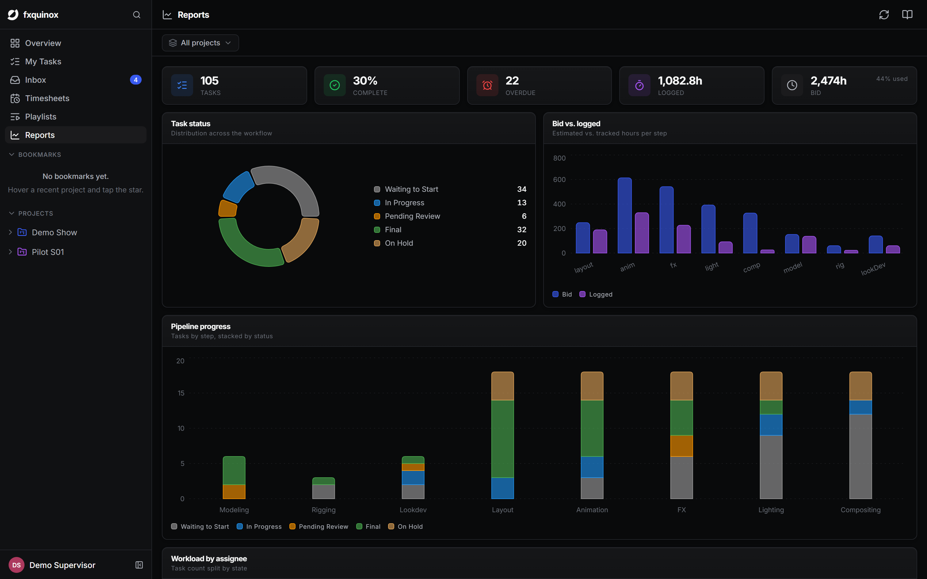
Reports in the left rail gives you a production dashboard: the health of the work at a glance, across all projects or scoped to one.
Scope
Use the project selector at the top to switch between All projects and a single show. The headline KPIs and all charts update instantly to reflect the selected scope — the same dashboard works for a studio-wide view or a single production.
Headline KPIs
At the top, five numbers give you the immediate picture:
| KPI | What it counts |
|---|---|
| Total tasks | All task records in scope. |
| % complete | Tasks in a done or approved state. |
| Overdue | Tasks past their due date and not yet complete. |
| Hours logged | Sum of all recorded time logs. |
| Bid hours | Total estimated hours, with a used-vs-bid indicator. |
Charts
Six charts sit below the KPIs, each driven live from the same data the rest of the app uses:
- Task status — the split of work across statuses (waiting, in progress, review, final, on hold), shown as a donut.
- Pipeline progress — tasks per pipeline step, stacked by status, so you can see how each department is tracking end to end.
- Bid vs logged — estimated against actual hours per pipeline step, so you can see where work is running over or under.
- Workload by assignee — how work and hours are distributed across the team, broken down by task state.
- Hours over time — logged hours aggregated by ISO week as an area chart, giving a rolling picture of team velocity and whether the pace is accelerating or trailing off.
- Project health — a per-project table: total tasks, done count, percentage complete, overdue count, bid hours and logged hours, so you can compare productions side by side.
Driven by your data
Reports read live from the API — they reflect the current state of your tasks, time logs and statuses with no extra setup or manual export.
Performance
The charts are loaded lazily in a separate bundle. On first open there may be a brief pause while the charting library loads; subsequent visits are instant.